

In today’s digital age, visual design is everywhere—colorful Instagram feeds, clean minimalist websites, stylish event posters, and uniquely branded packaging.
Yet often, design is misunderstood as mere ornamentation.
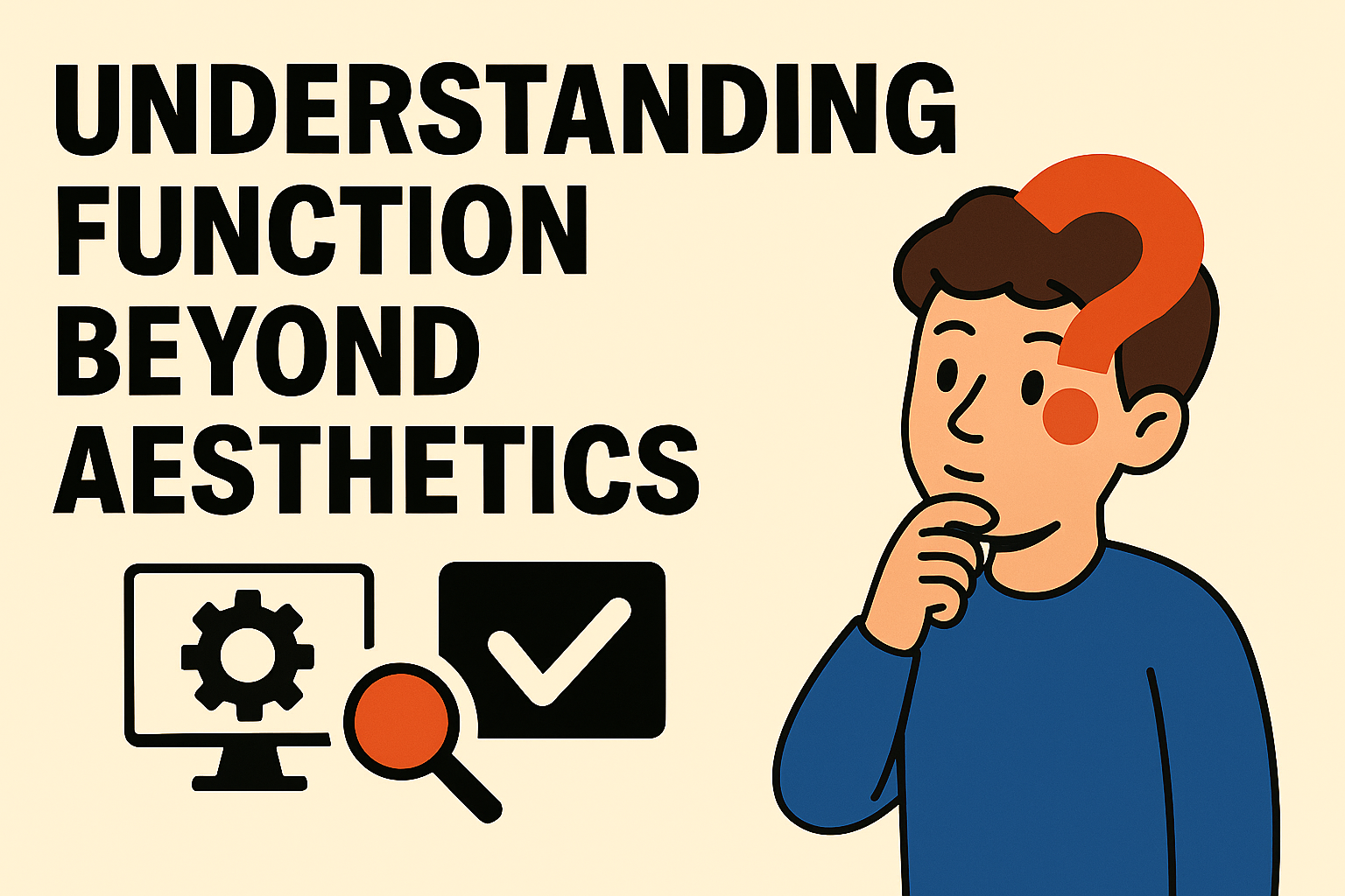
In truth, design is not just about aesthetics—it is a tool for communication, purpose, and impact.
This article explores why design is more than decoration—and why this understanding matters to designers, clients, and brands alike.
What’s the Difference Between Decoration and Design?
- Decoration is created to beautify, please the eye, or add flair.
- Design is created to communicate messages, solve problems, and drive action.
A simple example:
If you create a concert poster that looks visually stunning—but the band name, location, and time are unreadable—that’s decoration, not design.
Design is visual thinking. Aesthetics is one part—but not the only part—of the equation.
Design starts with intention. Every stroke, shape, or typographic choice should be rooted in clarity of message. Decoration, on the other hand, tends to exist without strategy—it adds surface appeal, but lacks communicative depth.
Design = Visual Communication
Every design element—color, typography, illustration, layout—is a language.
Designers are not just "decorators," but messengers.
A good design will:
- Direct the viewer’s attention
- Convey information quickly
- Persuade action
- Shape perception of a product or brand
That’s why every visual decision should have a purpose. Random choices weaken the message.
Even the placement of a logo or the spacing between lines of text can significantly affect comprehension. Design, when done right, becomes invisible—it doesn't call attention to itself, but smoothly delivers its intended message.
Common Problem: “As Long As It Looks Cool”
We often hear things like:
“Just make it look cool—bright colors, busy layout!”
“Use a funky font—something unique!”
These statements often reflect the mindset that design is merely decoration.
But if the visuals don’t guide attention to the main message—or worse, obscure it—then the design fails its function.
This attitude is especially common in industries where visual trends overshadow core communication needs.
Looking “cool” without clarity is like shouting in a language your audience doesn’t understand. It may seem exciting, but it leaves people confused and disconnected.
Good Design Is Effective, Not Just Attractive
Compare two posters:
- Poster A: Neon gradients, futuristic fonts, but the info is tiny in the corner.
- Poster B: Simple layout, high contrast, clear message front and center.
In real-world use, Poster B is more successful.
Why? Because it works.
The audience quickly understands the message—who, when, where, and why it matters.
Design that functions poorly—even if beautiful—can cost opportunities. Imagine an app interface so sleek you can’t find the buttons. Beauty becomes a barrier. Form should follow function—not fight it.
Design Principles as Solutions
Good design should answer:
- What is the communication goal?
- Who is the target audience?
- What is the core message?
- What medium is being used (print, digital, social)?
- What action do you want the viewer to take?
Only then should you determine style, color, layout—not the other way around.
Design is a solution-based discipline. A good visual identity, for instance, emerges from the brand's values and mission—not from what's trending on Pinterest.
Whether you're building a website or designing a product label, purpose-driven design starts by asking the right questions—not just choosing the right colors.
Aesthetics Still Matter—But...
Aesthetics aren’t the enemy. In fact, they’re tools that support effective communication.
Examples:
- Bright colors attract attention on a roadside billboard
- A cute mascot illustration makes a brand more approachable to young audiences
- Retro typography evokes nostalgia for vintage coffee products
But remember: aesthetics should serve the message—not distract from it.
When beauty reinforces purpose, it becomes powerfully persuasive. A good aesthetic enhances clarity, memorability, and emotional resonance. But it should never overpower the message.
Think of design like a film soundtrack—it should elevate the scene, not distract from the story.
Case Study: Logos That Are Simple but Effective
Consider:
- Apple’s logo
- Nike’s swoosh
- FedEx’s logo (with the hidden arrow in the negative space)
They may look simple—but they are highly functional:
- Instantly recognizable at any size
- Embedded with meaning
- Timeless—they don’t go out of style
They weren’t designed to look “busy,” but to function and be remembered.
Simplicity is not emptiness—it’s efficiency. A logo doesn’t need to explain everything about a company. It needs to represent it well, be adaptable, and carry equity across mediums.
These iconic examples prove that design succeeds when it’s clear, intentional, and deeply rooted in brand identity.
How to Think About Design as Function
1. Start With Purpose, Not Appearance
Ask: What do I want this design to achieve?
Is it to inform, attract, persuade, or clarify?
Only then move to visual style. Let function lead form.
2. Use Grids and Visual Hierarchy
Design isn’t random placement.
Use structure and prioritize elements for clear reading order.
Guide the eye. Good hierarchy ensures the most important information is seen first.
3. Test Your Design With Others
Ask: “Can you understand the main message at a glance?”
If not, the design needs refining. What’s obvious to the designer may be unclear to the audience.
4. Choose Aesthetics That Fit the Context
Style matters—but it should align with the brand, audience, and medium.
Not every client needs a trendy look. Sometimes, trust and clarity matter more than originality.
Designing for a bank is different from designing for a skate brand. Understanding the context makes design choices more meaningful.
Analogy: Design Is Like Architecture
Imagine an architect who only focuses on making a house look good—ignoring doors, lighting, airflow, or safety.
The house might look amazing—but it’s uncomfortable or even unusable.
Same with graphic design.
If you only chase looks without considering function, the result will be forgettable—or worse, confusing.
Like architecture, design must balance form and utility. A beautiful staircase that’s impossible to climb isn’t a success—it’s a hazard.
Function gives beauty a purpose. Without it, you're building visual sandcastles—quickly admired, quickly forgotten.
Bonus Thought: The Invisible Designer
The best design often feels invisible.
Not because it lacks visual appeal—but because it works so well that the user never feels friction.
Think of wayfinding signs in an airport, or instructions on an emergency exit.
You don’t pause to admire them—but they guide you when you need them most.
That’s powerful design. It doesn’t scream for attention. It just quietly, reliably serves.
Conclusion: Design With Intent, Not Just Appeal
Graphic design is not just about making things pretty.
It’s a tool for visual communication with purpose and impact.
As designers, our job isn’t just to create what looks “cool”—but what works and means something.
If you can combine function + aesthetics + context, you’re not just a screen decorator—
You’re a true visual problem-solver.
And in a world overflowing with noise and visuals, clarity is a rare and valuable skill.
Design with that in mind, and you’ll not only create beauty—you’ll create meaning.