

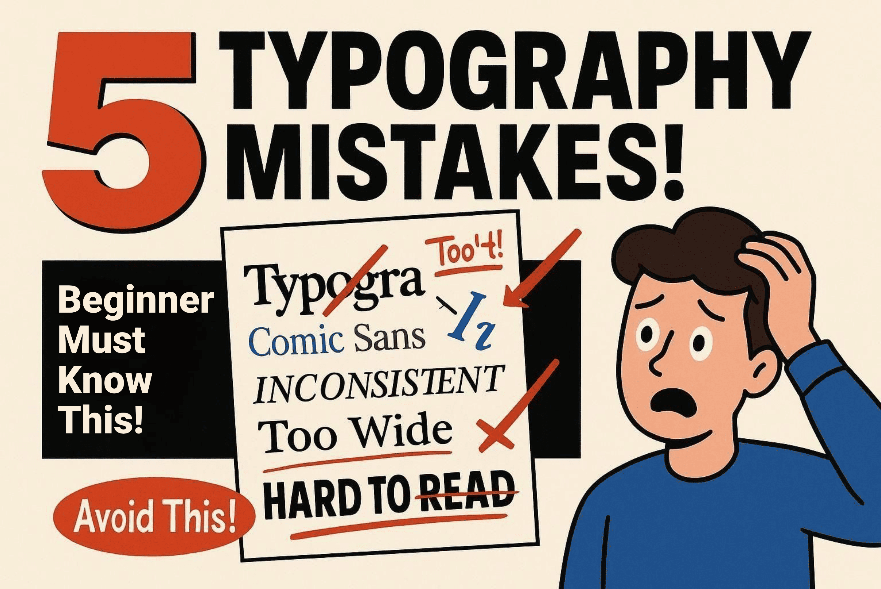
Typography is one of the most fundamental elements in the world of graphic design, whether in digital or print media. While it may seem simple, the right use of type has immense power in shaping perception, conveying messages, and creating a pleasant visual experience. Unfortunately, many beginner designers (and even some experienced ones) still frequently make basic typography mistakes.
In this article, we’ll discuss five common typography mistakes, complete with explanations, examples, and practical solutions to avoid them. This article is perfect for those who want to strengthen their design fundamentals, refine their work, and present themselves more professionally in visual communication.
1. Using Too Many Fonts in One Design
One of the most classic typography mistakes is using too many font types. Some beginner designers tend to think they need to make a design look “unique” or “different” by mixing multiple fonts together. Unfortunately, instead of being visually appealing, the result often ends up confusing and visually unfocused.
Why Does This Happen?
The desire to stand out or create a “wow” effect sometimes leads designers to sacrifice readability and design consistency. In truth, good design should communicate clearly and efficiently.
Solution: Limit Your Font Choices
Use a maximum of 2–3 fonts in a single project. Choose combinations that complement each other, such as:
- Serif for headings (e.g., Ringift)
- Sans-serif for body text (e.g., Refinder)
- Script for accents or emphasis (used sparingly)
Ensure that the font combinations still reflect the brand’s personality and don’t clash visually.
2. Ignoring Typographic Hierarchy
Typographic hierarchy helps guide the reader’s eye naturally to the most important parts of a design. Without hierarchy, all elements appear to have equal weight, making it harder for the key message to come through effectively.
Example of a Mistake
Headlines, subheadings, and body text all appear in the same size or use indistinguishable fonts and colors. As a result, readers have to “struggle” to understand the information flow.
Solution: Build Visual Structure with Typographic Scale

Use a “typographic scale” to establish a clear hierarchy. For example:
A combination of size, weight, color, and spacing can create a strong visual structure. Create internal guidelines to maintain typography consistency across different pages or media.
3. Neglecting Kerning and Tracking
Kerning is the space between individual letter pairs, while tracking is the overall letter spacing in a word or sentence. Errors in these settings can make words hard to read or visually awkward.
Real Case Example
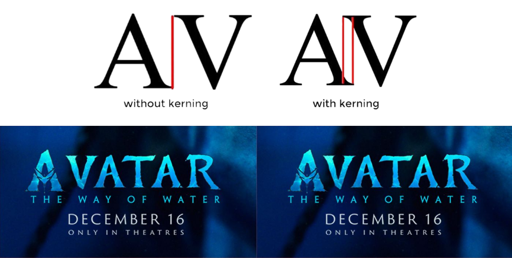
The word “AVATAR” often looks unbalanced if the space between “A” and “V” is too wide. This can make a logo or headline appear unprofessional.
Solution: Check and Adjust Manually
For headlines, logos, or other key design elements, manually adjust kerning using design software like Adobe Illustrator, InDesign, or Figma. View your design at both small and large sizes to ensure it remains legible and visually pleasing.
Don’t hesitate to use shortcuts like “Opt + left/right arrow” (on Mac) or “Alt + arrow” (on Windows) to adjust kerning quickly.
4. Not Matching Typography to Brand Personality
Typography isn’t just about aesthetics—it also represents the values and personality of a brand. Choosing the wrong font can dilute your brand message or even reduce audience trust.
Example of a Mistake
Using a comic-style font (like Comic Sans) for a financial company or choosing a gothic-style font for a children’s brand. This sends the wrong signal to the audience.
Solution: Understand the Brand’s DNA and Build a Moodboard
Before selecting fonts, understand the brand persona:
- Is your brand formal or casual?
- Do you want to appear modern or classic?
- Is your brand more feminine, masculine, or neutral?
Then, create a moodboard with font references and other visual inspirations that match the brand. Test a few options and get feedback from your team or client before making a final decision.
5. Incorrect Leading and Paragraph Spacing
Leading is the space between lines in a paragraph. Poor leading settings can make a paragraph feel cramped (claustrophobic) or too loose, affecting reading comfort.
Ideal Leading Recommendation
Use 120–145% of the font size for leading. For example:
- Font size 14pt → ideal leading: 17–20pt
- Font size 18pt → ideal leading: 21–25pt
Additional Tip: Mind Margins and Alignment
In addition to leading, make sure to use consistent margins and alignment. Justified alignment may look neat, but beware of “rivers” or large spaces that appear between words. Left-aligned text is generally more comfortable to read, especially on digital screens.
Bonus: Small Details Often Overlooked
- Use a Grid System
- Good typography should be supported by a strong grid system. Grids help maintain balance and visual rhythm, especially in magazine layouts, websites, or presentations.
- Avoid Widows and Orphans
- In editorial typography, avoid single words left alone at the beginning or end of a paragraph. These disrupt flow and make the layout look broken.
- Consistency is Everything
- A design may use various fonts, colors, and sizes—but without consistency, everything appears scattered. Use a style guide or design system to maintain coherence.
Typography is more than just choosing beautiful fonts. It’s a complex system of visual communication that blends aesthetics and function. By avoiding the five mistakes above—and understanding basic principles like kerning, hierarchy, leading, and appropriate font selection—you can create designs that are far more professional and effective.
Don’t be afraid to experiment, but always remember that great typography begins with a strong understanding of its foundations. Whatever kind of design you're working on—posters, branding, websites, or editorials—solid typography will be key to successful visual communication.